
Ever wondered why some treatments seem to work like magic while others barely make a dent? It’s easy to get lost in the numbers when comparing risks. That's why we use something called relative risk reduction. This handy method shows exactly how much a treatment lowers your chance of an event, turning raw percentages into clear benefits you can see. Today, we’re breaking down how relative risk reduction makes research easier to understand and why it’s a useful tool for everyday health decisions.
Relative Risk Reduction Brings Clarity to Research
Imagine you have two groups of people. In one group, 5 out of 100 might face a certain event, while in the other, 10 out of 100 do. Relative risk (RR) compares these chances by showing the ratio between them. In this example, the RR is 0.5, meaning the first group’s risk is half that of the second.
Relative risk reduction (RRR) builds on this by showing how much the risk changes with a treatment or change in conditions. To figure it out, you subtract the event rate in the treated group from the rate in the untreated group, then divide that by the untreated group’s rate. For instance, if the risk drops from 10% to 5%, you calculate (10% – 5%) divided by 10%, which equals 50%. This tells us that the relative risk is reduced by half.
In practice, clinicians start by noting the risk without treatment (the control rate) and the risk with treatment (the experimental rate). They then subtract the experimental rate from the control rate, divide by the control rate, and convert this number into a percentage. A decline from 10% to 5% shows a 5%-point drop in absolute terms but a 50% drop when looked at relatively. This method helps them understand how well a treatment works and explain its benefits in straightforward terms.
Fun fact: Before becoming a world-renowned scientist, Marie Curie carried test tubes of radioactive material in her pockets, unaware of the dangers.
Comparing Relative and Absolute Risk Reduction Metrics
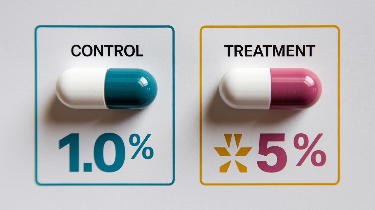
Absolute risk reduction is the direct difference between the percentage of events in a control group and those in a treatment group. For example, if 10% of patients in the control group have an event and only 5% in the treatment group do, you subtract 5% from 10%, which gives you a 5% absolute reduction. This value shows the real benefit from the treatment.
Relative risk reduction puts this benefit into perspective by comparing it to the starting risk. In the example, the 5%-point drop divided by the initial 10% gives a 50% reduction. While this percentage highlights the change relative to the original risk, it doesn’t capture the full picture without knowing the actual difference.
| Measure | Definition & Formula |
|---|---|
| ARR | Control Event Rate – Treatment Event Rate (e.g., 10% – 5% = 5%) |
| RRR | (Control Event Rate – Treatment Event Rate) / Control Event Rate (e.g., (10%-5%)/10% = 50%) |
Using both ARR and RRR together gives a clearer view of how effective a treatment is. ARR shows the actual change in risk, while RRR illustrates how big that drop is compared to the original risk. This balance helps doctors and patients understand the benefits better and make more informed decisions.
Clinical and Epidemiological Applications of Relative Risk Reduction
When we look at heart studies, relative risk reduction helps us see how well a treatment works. For example, if someone has a 20% chance of a heart attack over 10 years, a treatment that cuts that risk by 30% can lower it to about 14%. In simple terms, this means the treatment reduces risk by 6%, so roughly one heart attack is prevented for every 17 people treated.
Doctors compare the event rates between those who get the treatment and those who do not, which gives them a clear picture of its effectiveness. This method is key in understanding treatment results in controlled trials.
Relative risk reduction is also very valuable in studies for vaccines and safe drug use. Researchers use it to see how much a vaccine cuts down on illness risks or how well a drug lowers side effects. By measuring the drop in risk, they can figure out how to better protect people in large studies.
Public health experts also use these figures to decide which prevention methods work best for communities. They compare different risk reductions to focus on strategies that will lower disease rates the most.
Interpreting Relative Risk Reduction: Pitfalls and Limitations

Relying only on relative risk reduction can make a treatment seem more effective than it really is. When the baseline event rate is low, a dramatic percentage drop might sound impressive, but the actual chance of something happening could still be very small. This can lead to decisions based on incomplete information.
To get a clearer picture, it's helpful to look at other numbers too. Absolute risk reduction shows the real difference in risk, and the number needed to treat tells you how many people must use the treatment to prevent one adverse event. Odds ratios and hazard ratios can also add context by showing risk in different study setups or over time. Simple charts or tables can make these comparisons easier to understand.
Experts recommend always pairing relative risk reduction with these additional measures. This balanced approach offers a full view of treatment benefits and helps avoid misleading interpretations.
Graphical Representation of Relative Risk Reduction in Studies
Charts help turn confusing numbers into clear pictures so you can see risk changes before and after a treatment. They give busy doctors and patients an easy way to understand the big picture.
Forest Plots: These charts show the relative risk reduction along with ranges that tell you how sure we can be about the results. They compare different studies side by side, making it simple to see where results agree or vary.
Bar Charts: With bar charts, you can look at baseline and treatment event rates next to each other. This setup makes it clear how much risk drops both in numbers and as a percentage.
Icon Arrays: Imagine a group of 100 patients. Icon arrays turn percentages into real counts by showing outcomes with little icons. This way, you can easily see the overall effect in a more tangible way.
When choosing a graphic, think about your audience. If you’re talking to experts who love details, forest plots might be the best choice. For a wider audience, bar charts and icon arrays usually make things easier to grasp. Pick the tool that best shows both the relative and absolute changes in risk without adding confusion.
Integrating Relative Risk Reduction with Number Needed to Treat and Other Metrics

NNT tells you how many patients need a treatment to stop one bad outcome. It comes from looking at the actual difference in risk, which makes it a quick tool for busy settings. A lower NNT can help a doctor decide that a treatment is worthwhile, especially when there are limited resources.
Different study designs bring in other useful numbers like odds ratios and hazard ratios. In emergency care, hazard ratios show which treatments work fast. When problems build up slowly, odds ratios give another view on risk. For example, a doctor might notice that even a treatment with a moderate NNT has a strong hazard ratio, meaning it cuts down bad events quickly.
Using these numbers together builds a clear guide for choosing treatments. A treatment with a modest NNT and a strong hazard ratio might mean fast, real benefits. This way, doctors can weigh how much risk changes and when outcomes happen, helping them tailor care to each patient.
Final Words
In the action, we broke down how comparing event rates leads to clear insights. We explained the math behind relative risk reduction, calculating benefits by measuring changes from control to treatment rates.
We also outlined the role of absolute differences, visual tools, and integrating other metrics like number needed to treat to provide a balanced view. Using relative risk reduction alongside these measures can help you make safe, informed choices. Small, evidence-backed steps like these pave the way for healthier, manageable routines.